


Koru was created by myself and Faridah Adam for our senior degree project at MICA. We started out with a broad dream: to promote the discussion of mental health in an exciting way. Through a ton of research and a social design approach, we found that a game would be a fun way to bring everyone together—whether they have a full-on mental disorder or college stress—and just talk about it.
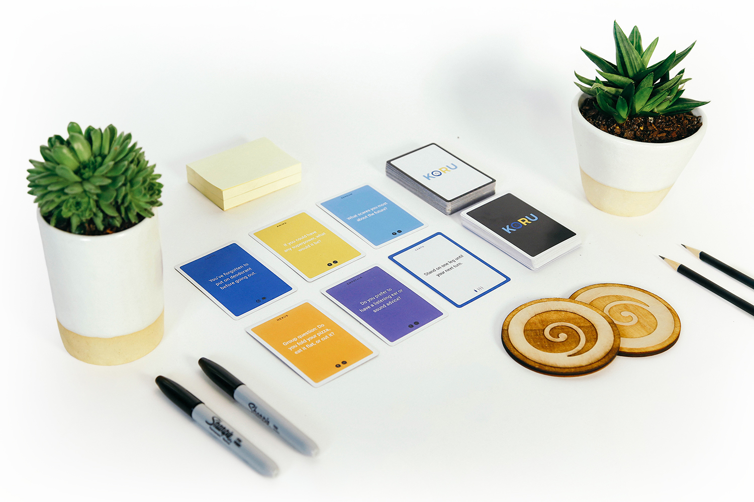
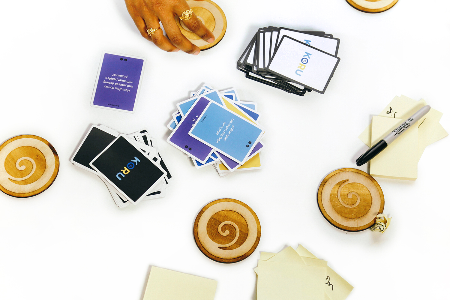
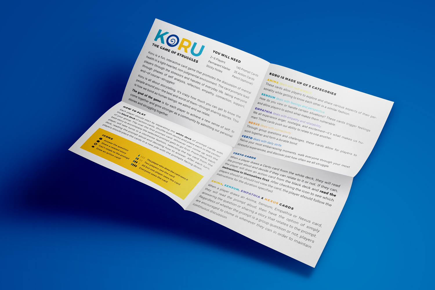
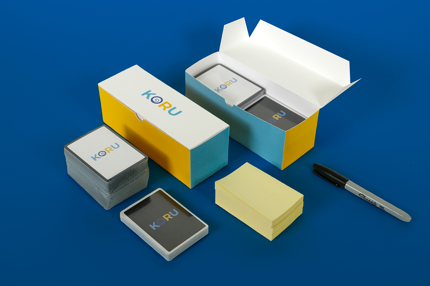
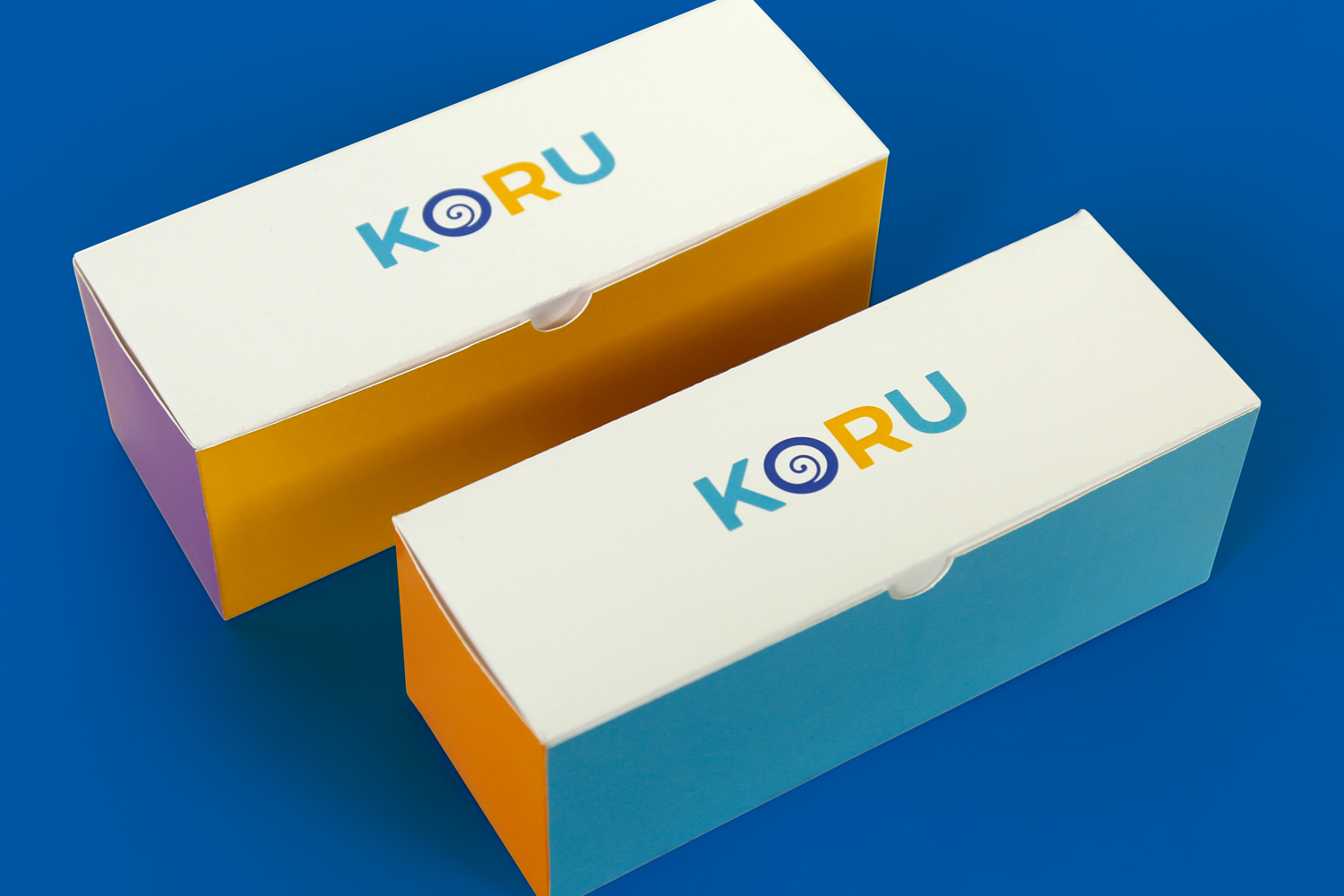
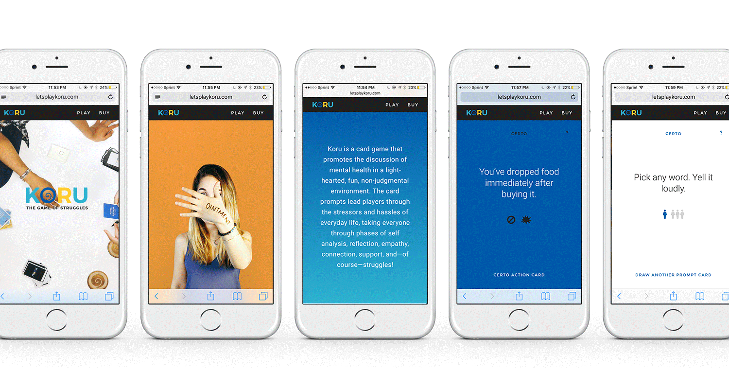
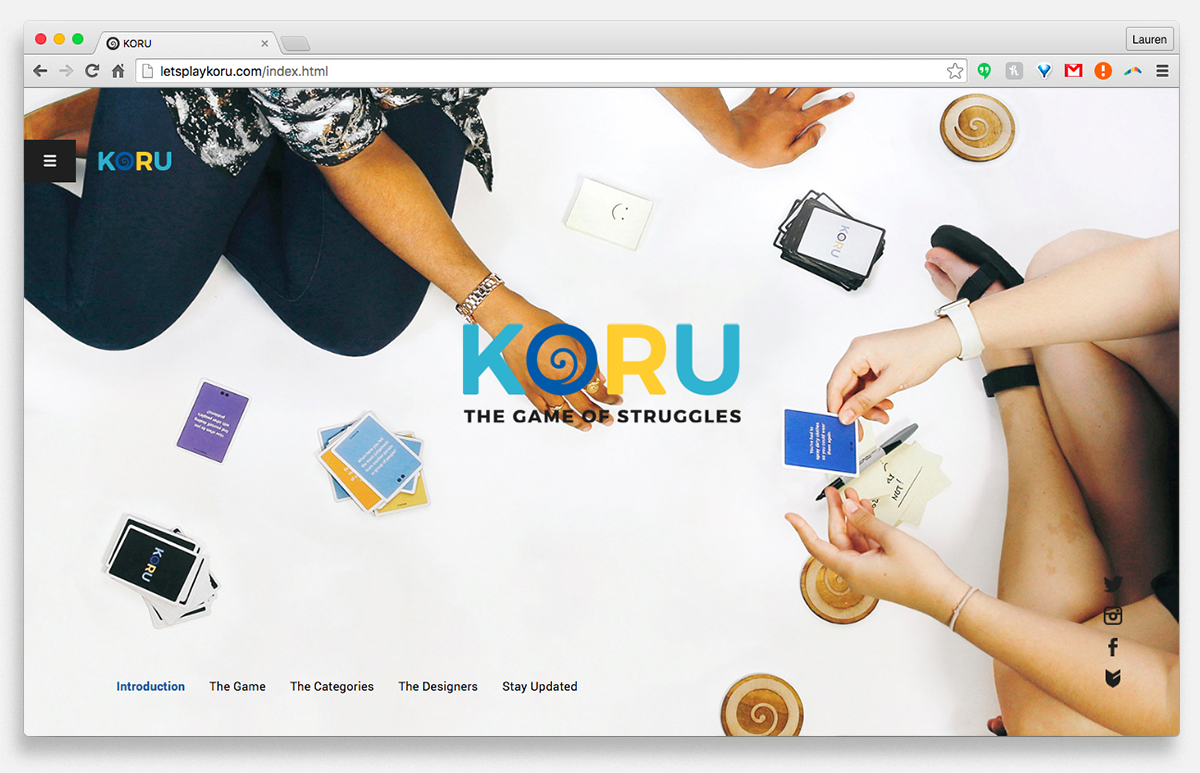
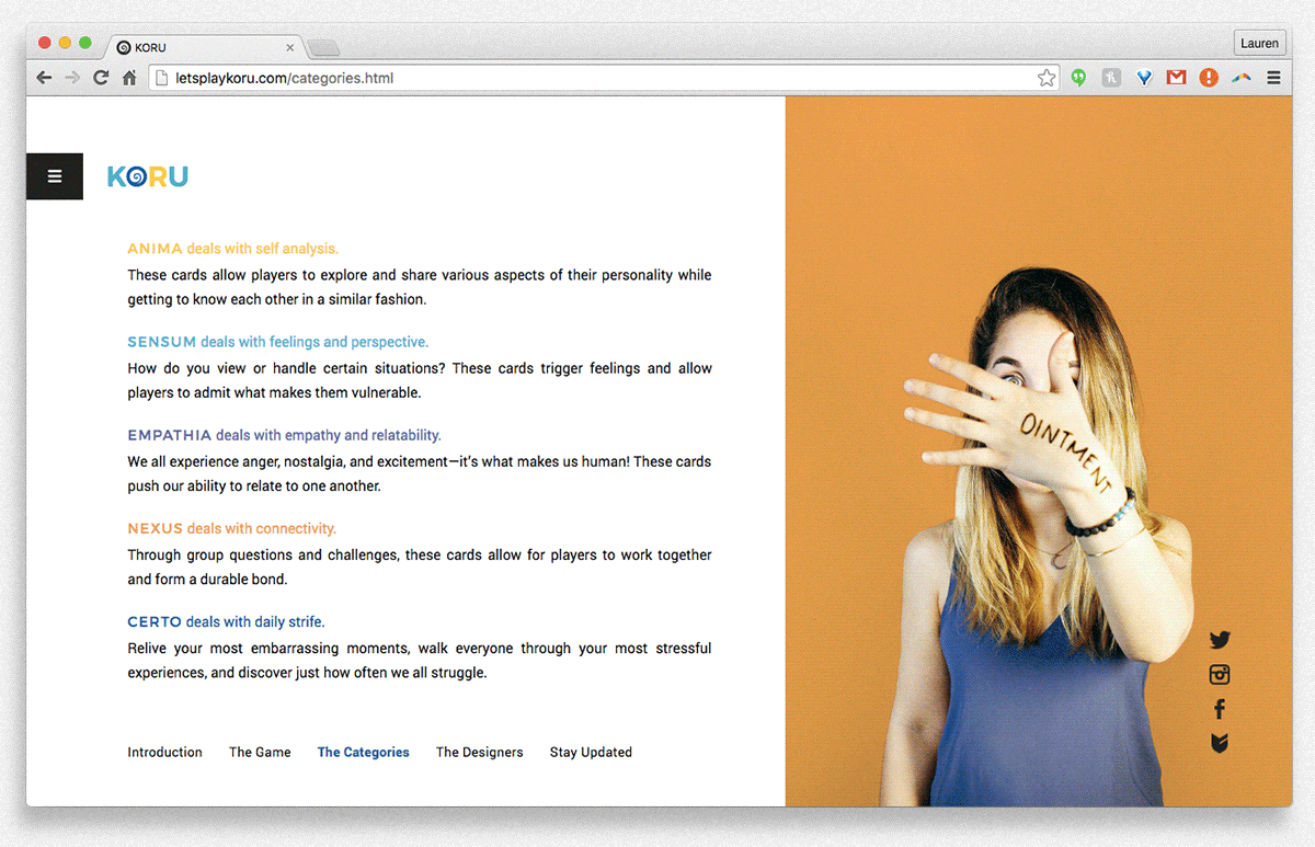
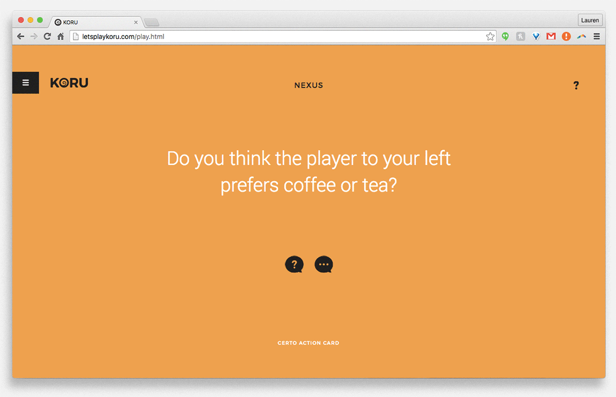
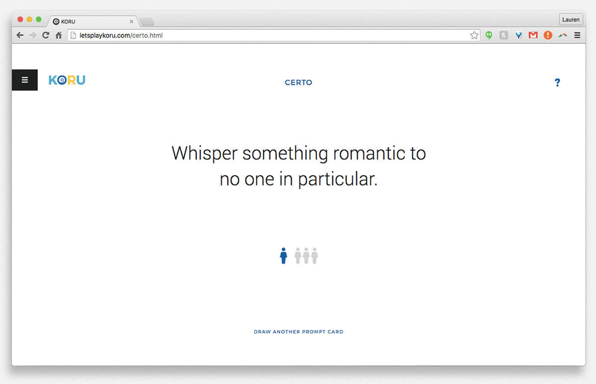
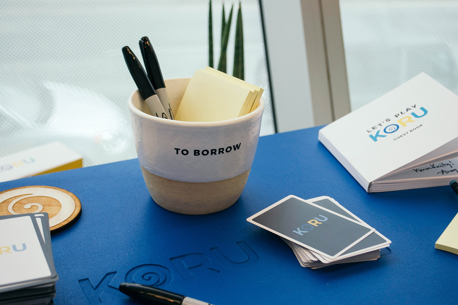
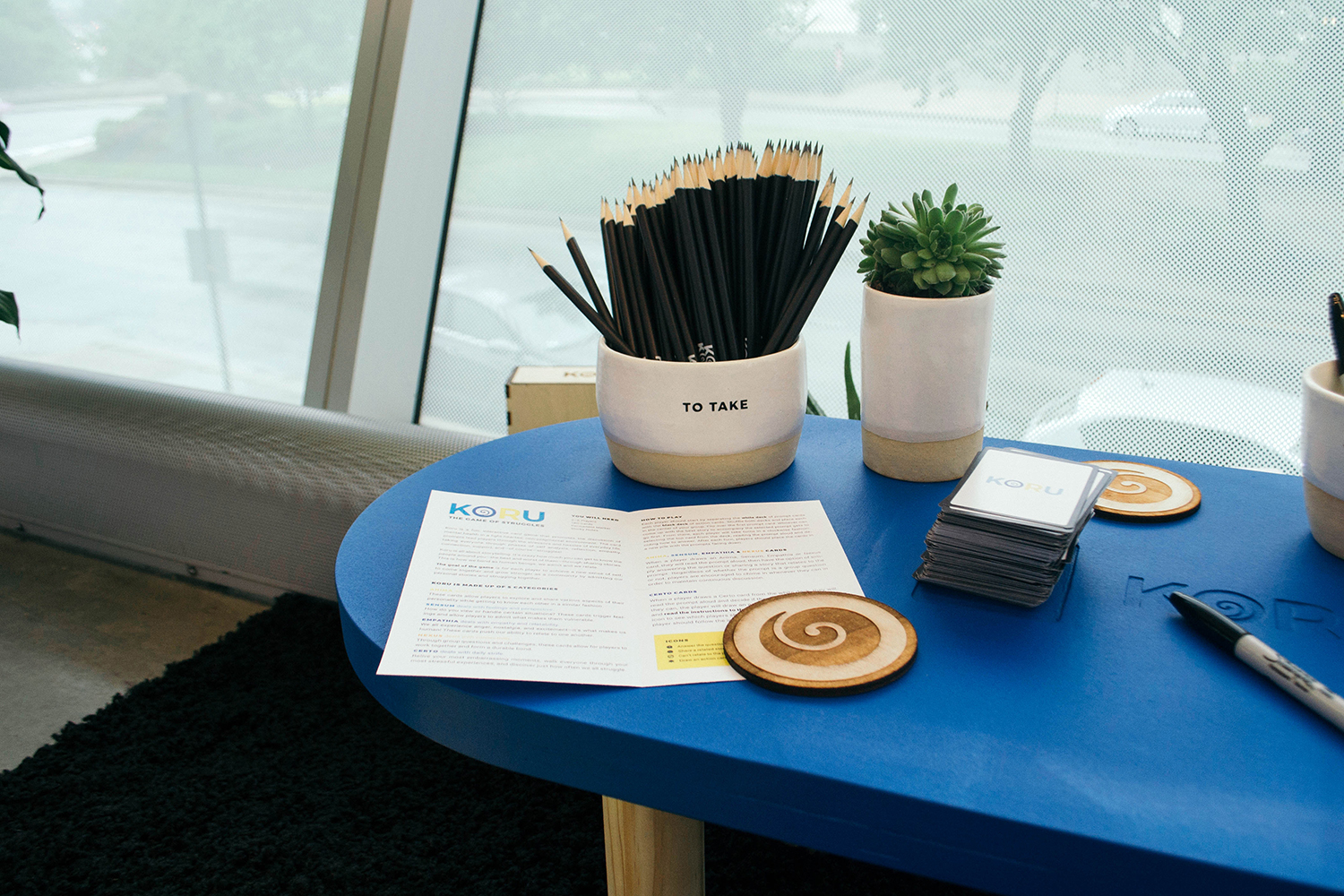
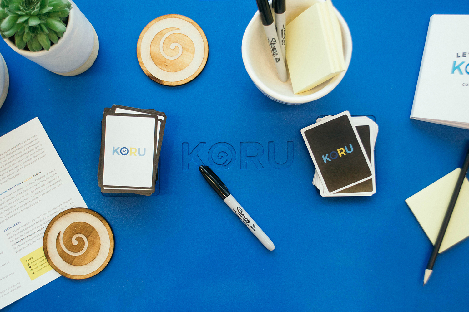
Koru is a card game that promotes the discussion of mental health in a light-hearted, fun, non-judgmental environment. The card prompts lead players through the stressors and hassles of everyday life, taking everyone through phases of self analysis, reflection, empathy, connection, support, and—of course—struggles! Koru is all about storytelling and struggling. It’s crazy how much you can get to know the people around you—the best and worst of them—through telling stories. This is how we bond as human beings: we admit and we relate. The idea is to struggle openly. The more a player struggles, the further they advance in the game. Being able to share, relate, and assist gives players the upper hand and adds to the larger narrative.
The goal of the game is for each player to achieve a new sense of self; to come together and grow stronger as a community by admitting our personal stories and struggling together.
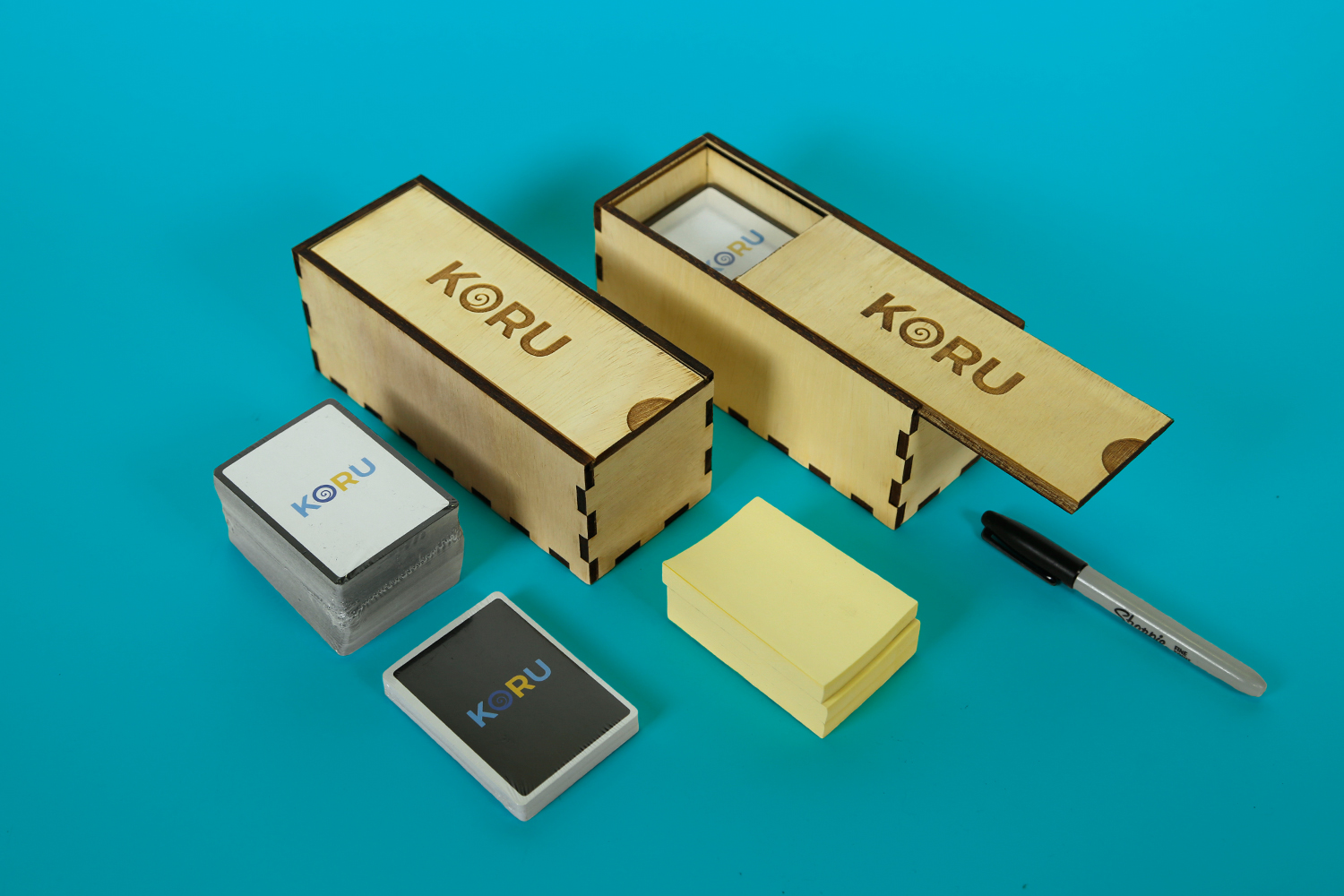
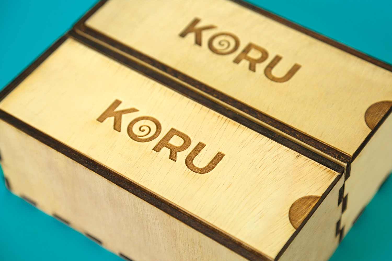
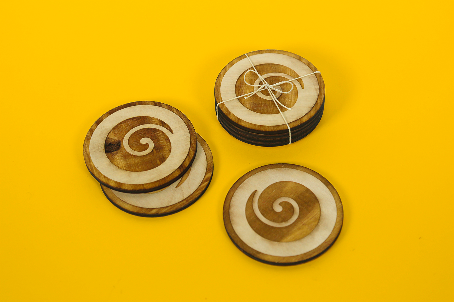
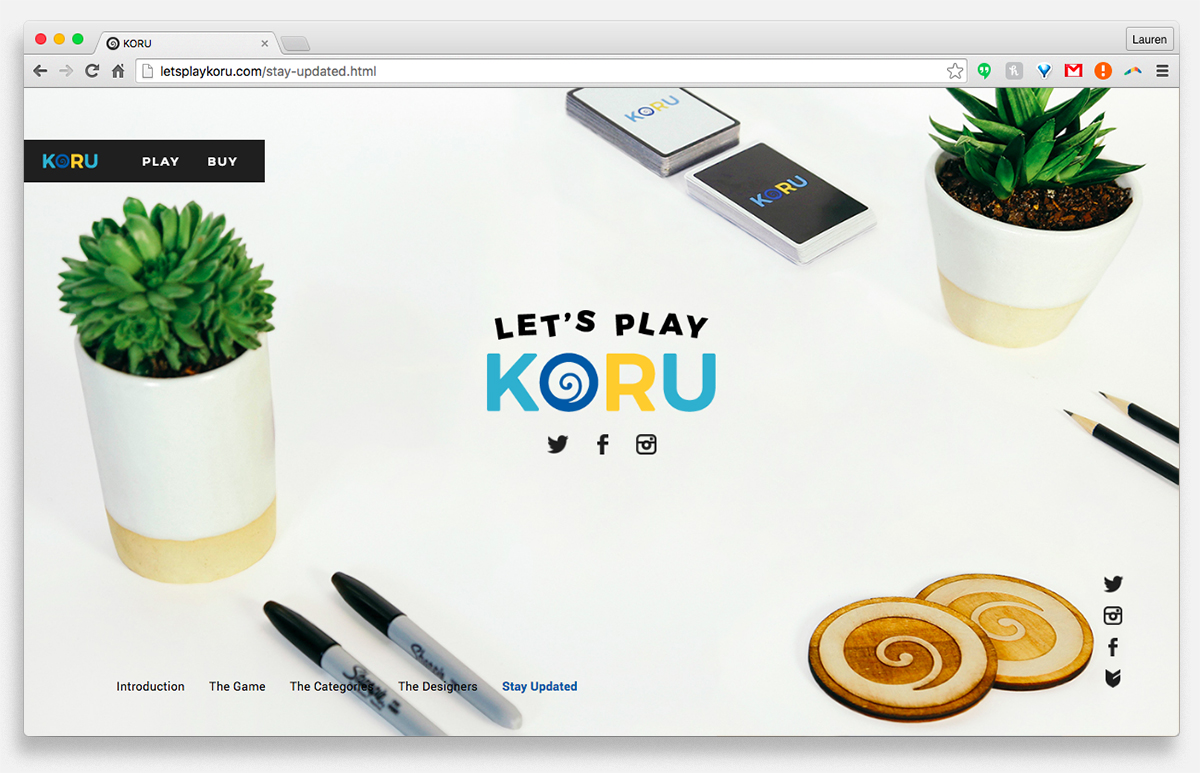
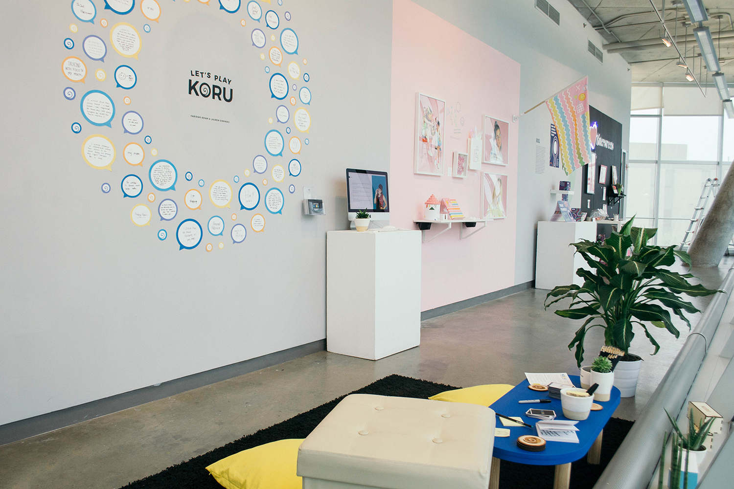
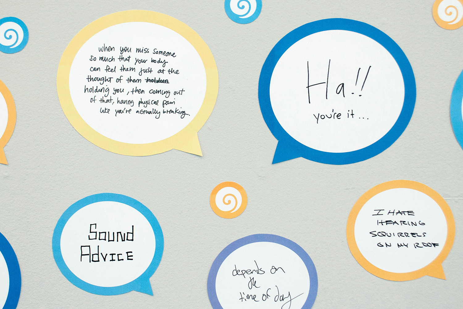
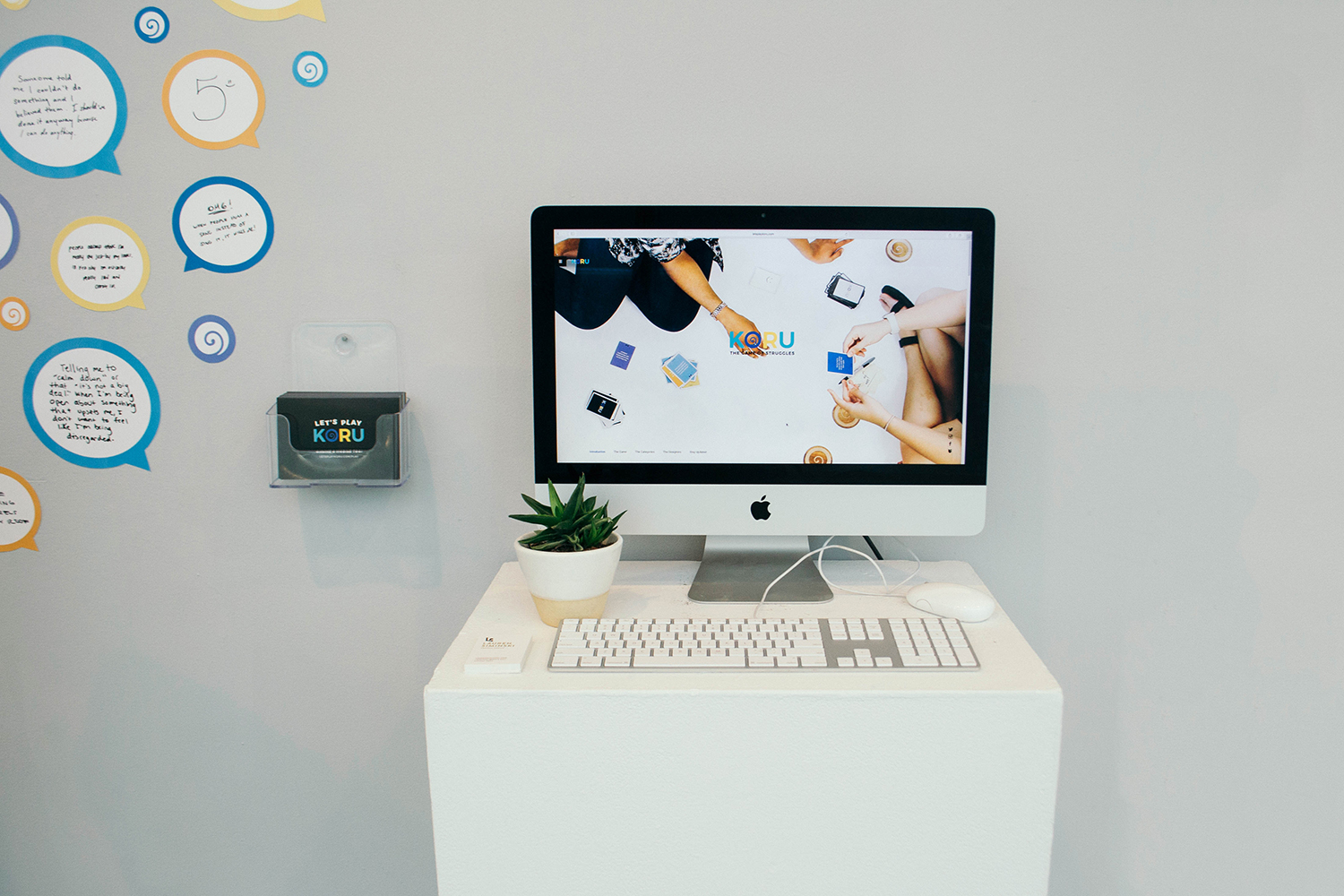
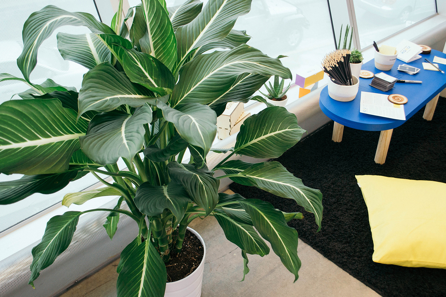
At the end of the semester, we put together an exhibition to display our final project. We curated a very comfortable, home-like space for people to play Koru. Using the CNC Router and Laser Cutter, we built a hand-painted, custom floor table for people to sit around on our large shag rug and floor pillows. As an additional element, we covered the wall in speech bubbles with examples from 40+ people who answered our prompt questions and introduced how the narrative could go.
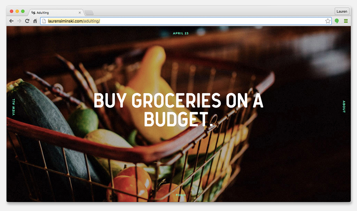
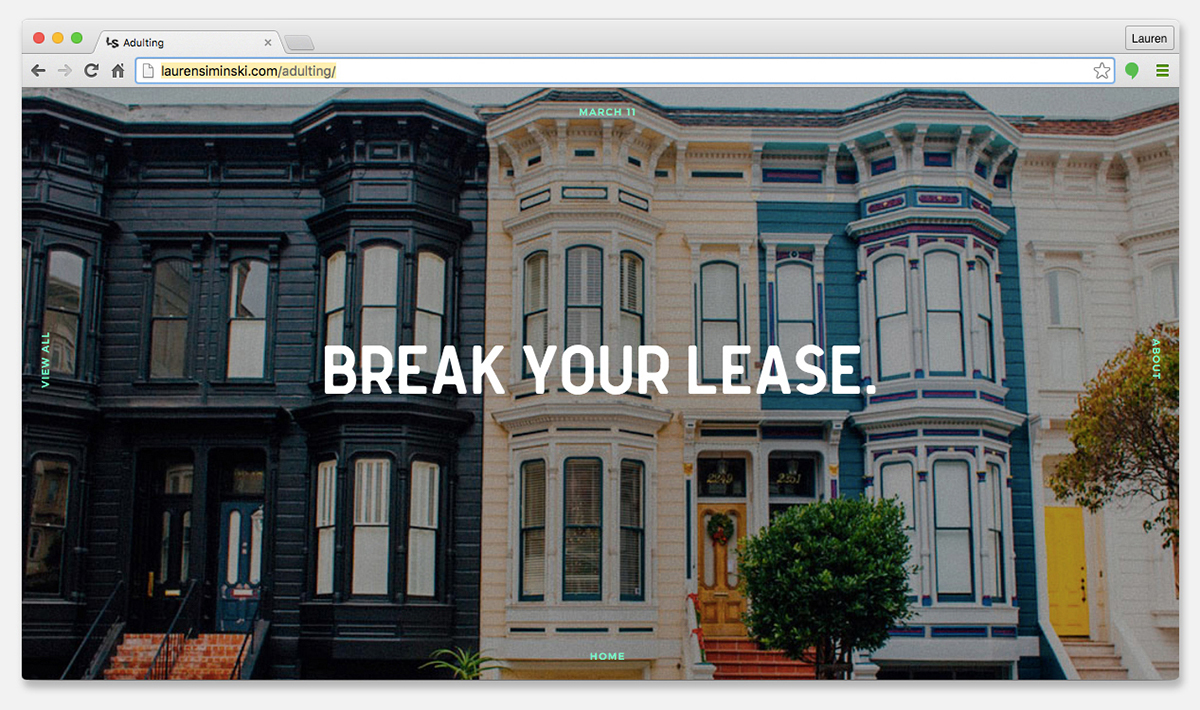
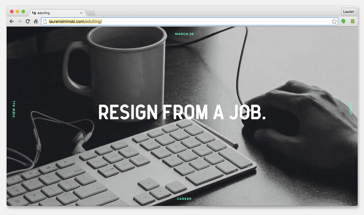
Every twenty-something year old (myself included) wants to complain about adulthood—not being prepared enough and not having their life together only 1/4 of the way into it. For this project, I wanted to design a how-to in an unconventional way. I wanted something I could relate to and easily revisit after completion to use for my own benefit.
My goal was to use an unfamiliar medium and approach the problem in a realistic way. Millennials tend to go straight to the internet anyway, so using JavaScript, I designed and coded a website that every day of the year, introduces a new “adulting” tip, trick, or tutorial, linking to an external source for the viewer to read, watch, and learn. Essentially, if you refer back to this website everyday for a year—or even better, make it your browser’s homepage—you’ll undoubtedly find yourself struggling less and less when faced with the typical tasks of adulthood.
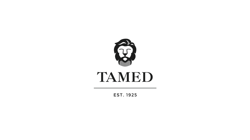
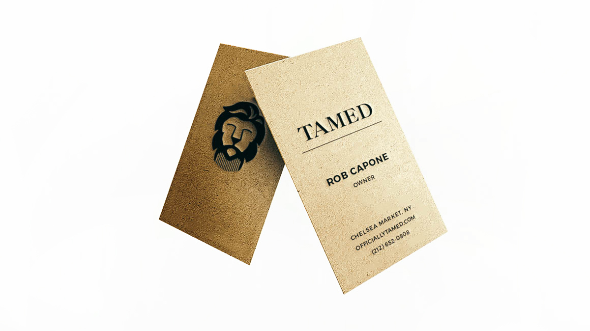
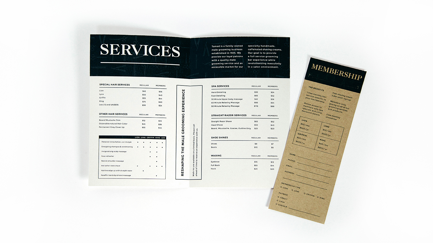
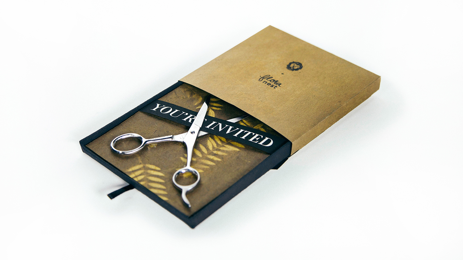
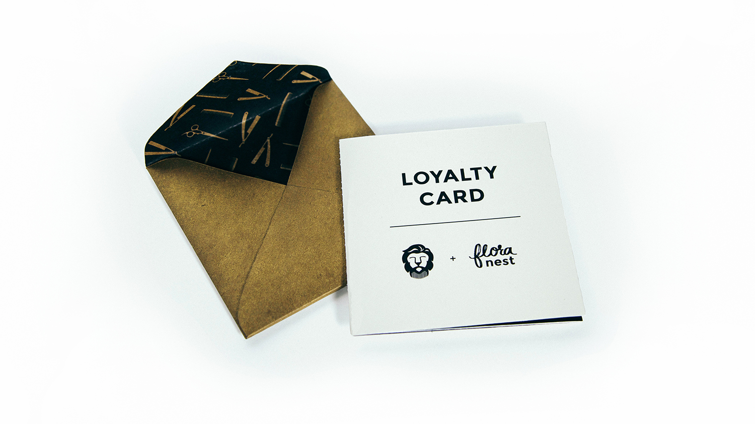
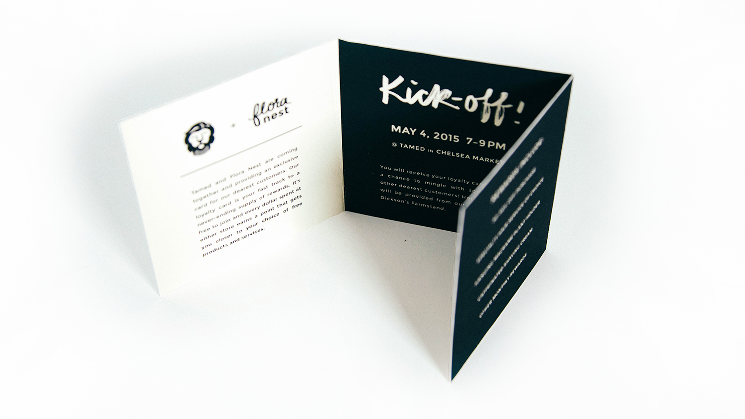
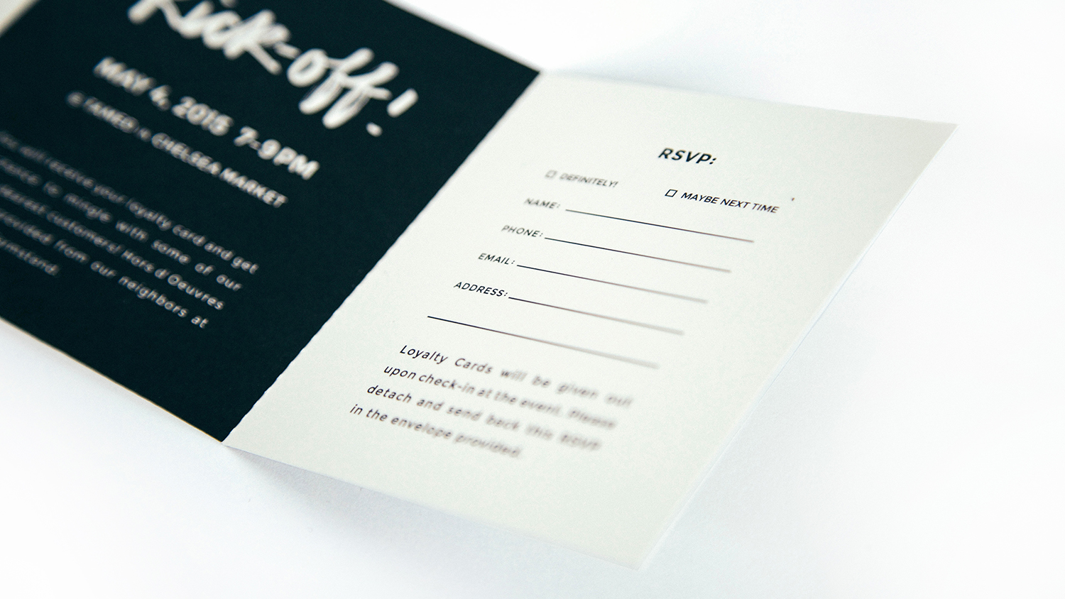
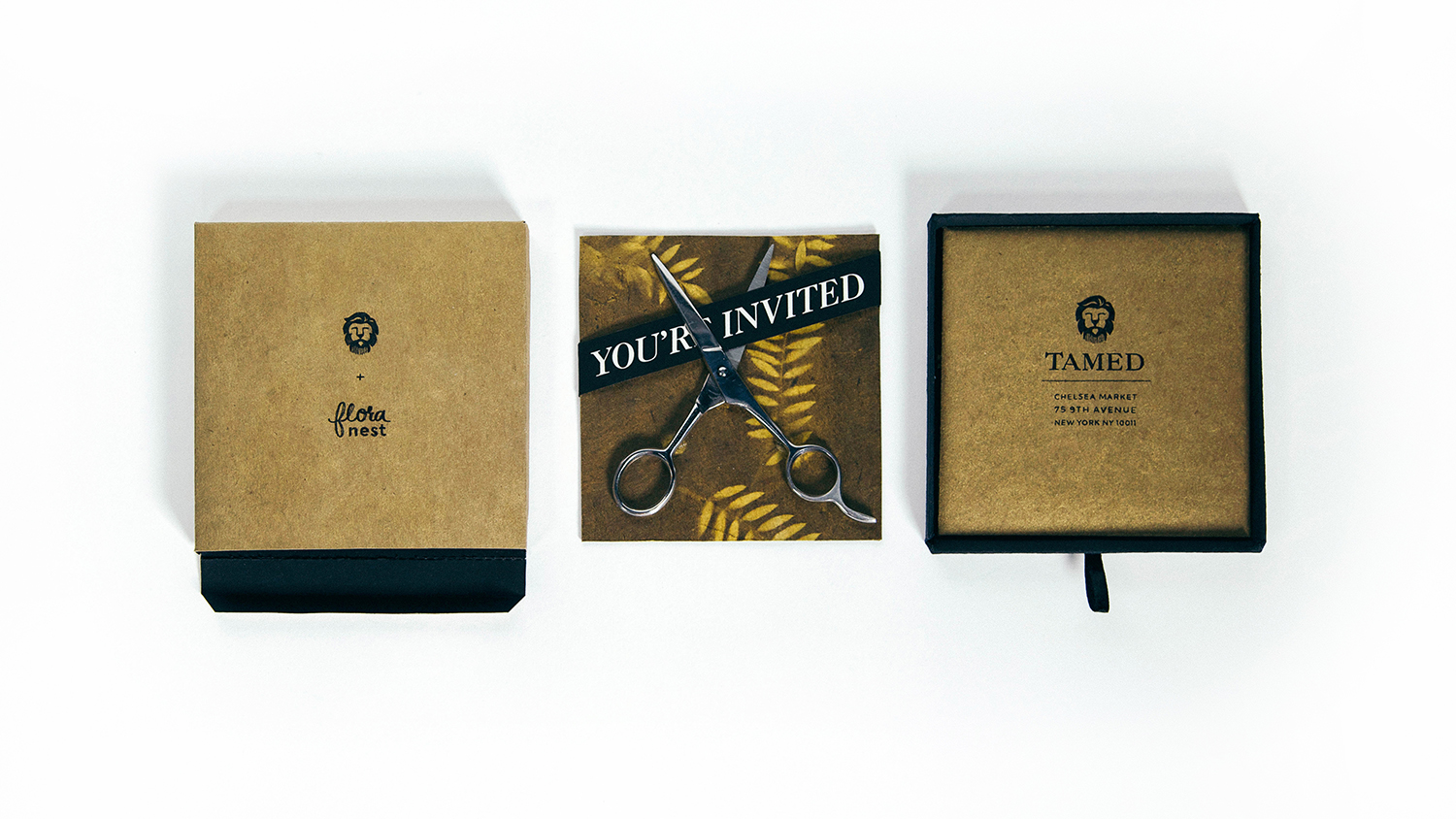
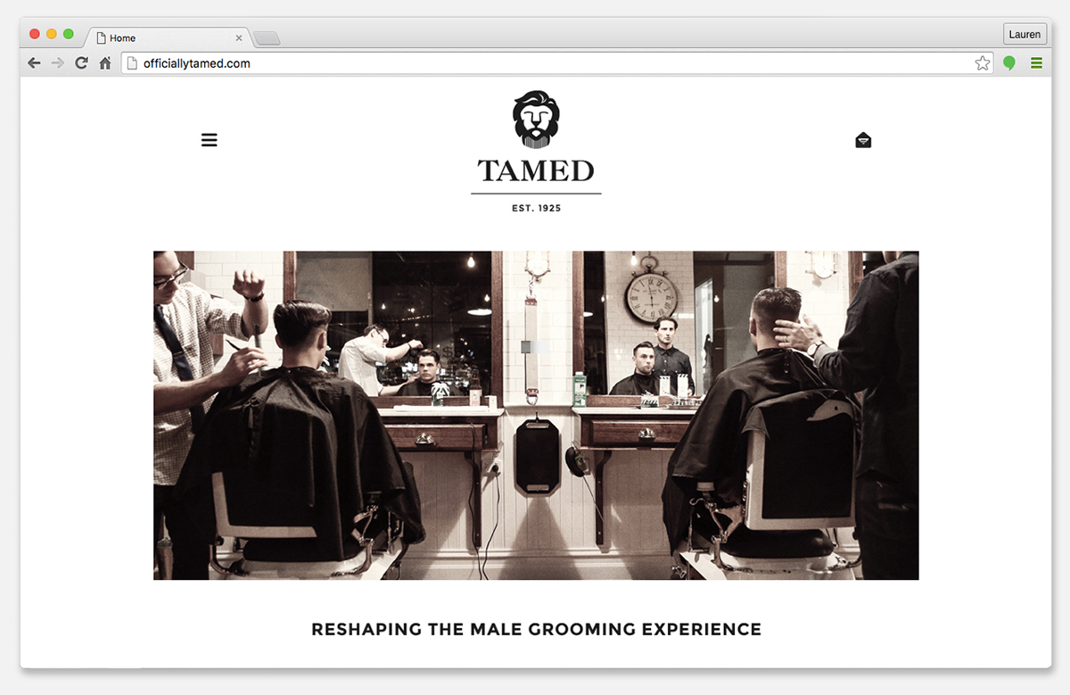
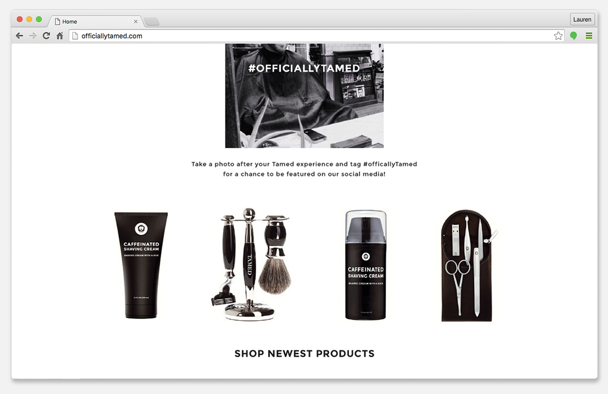
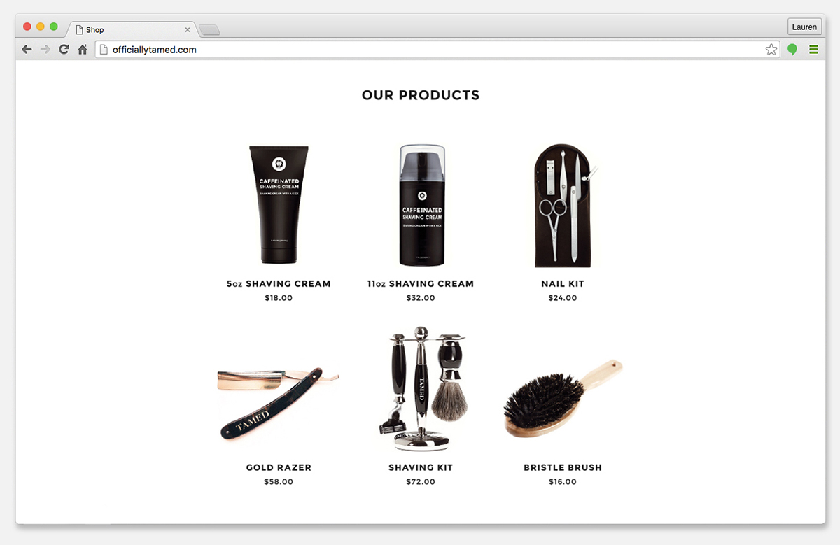
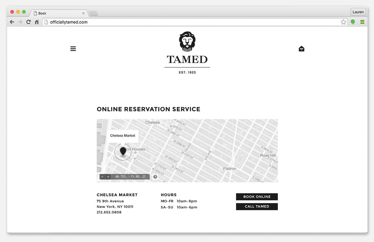
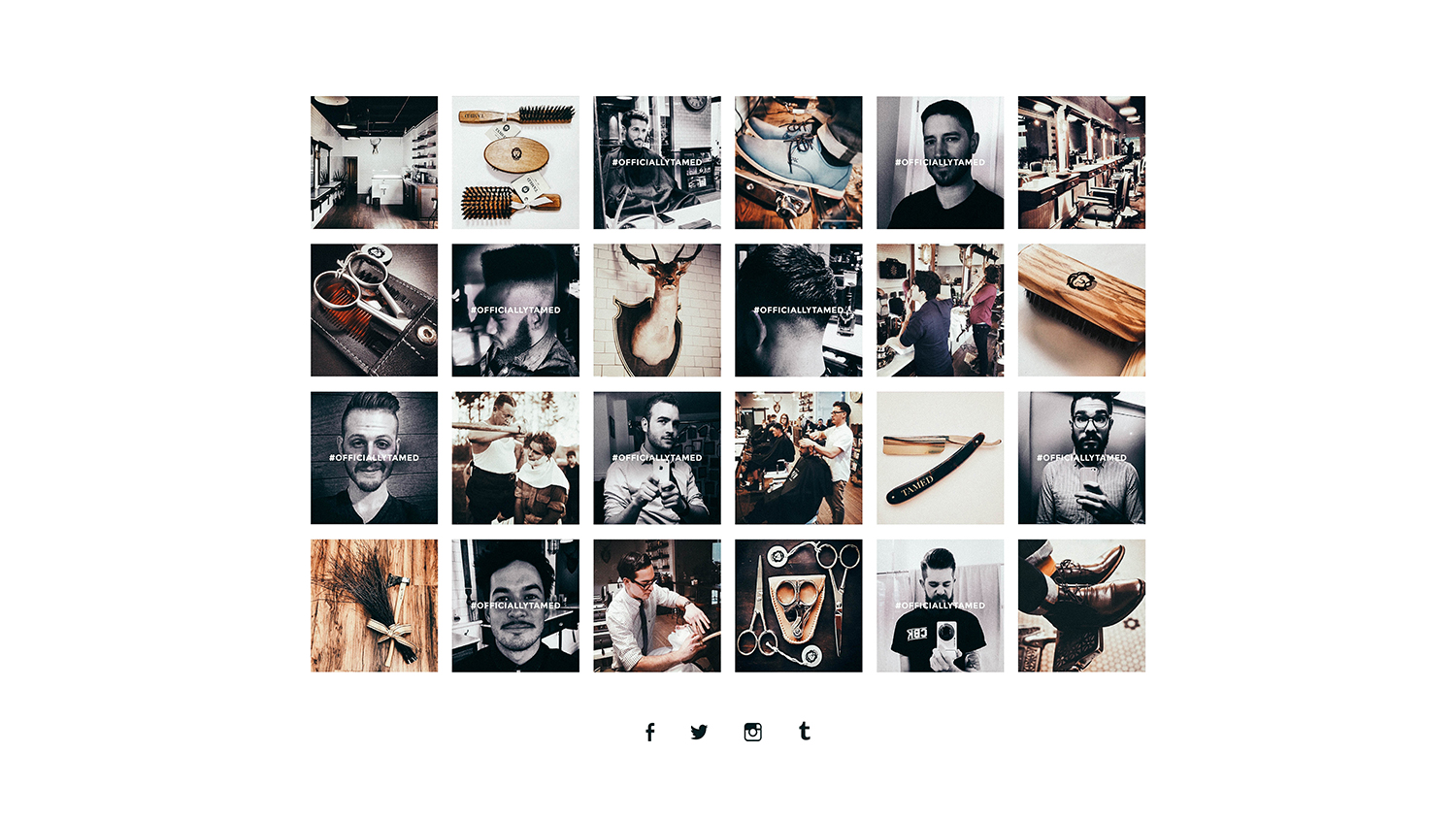
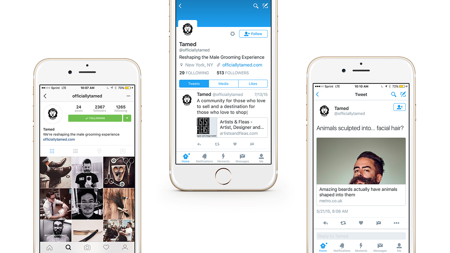
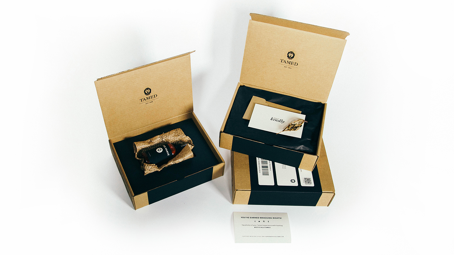
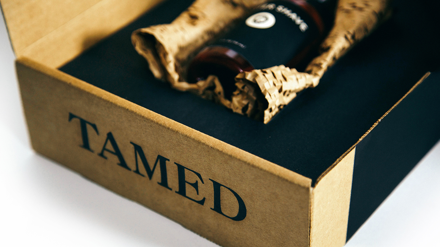
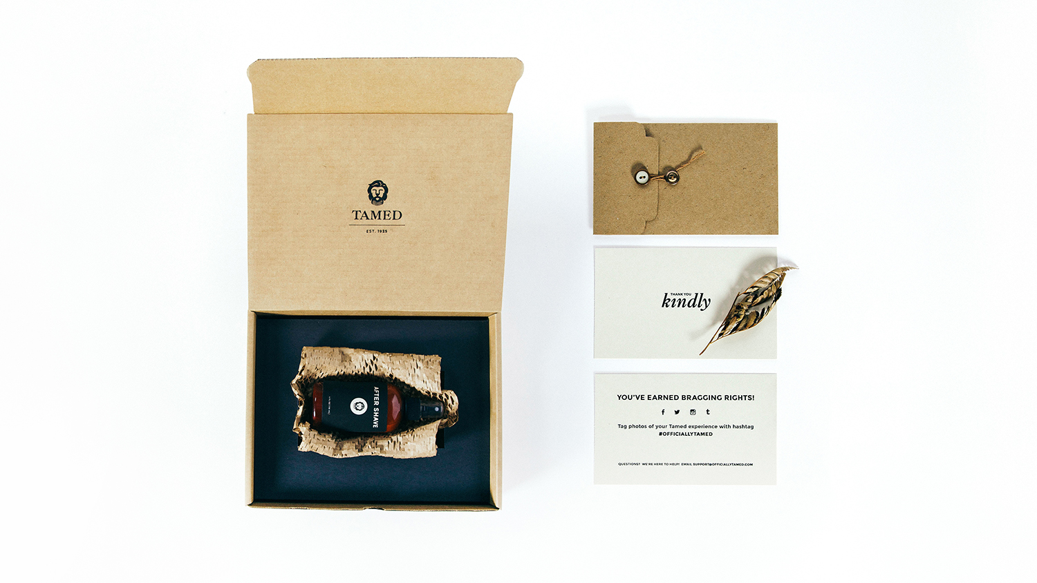
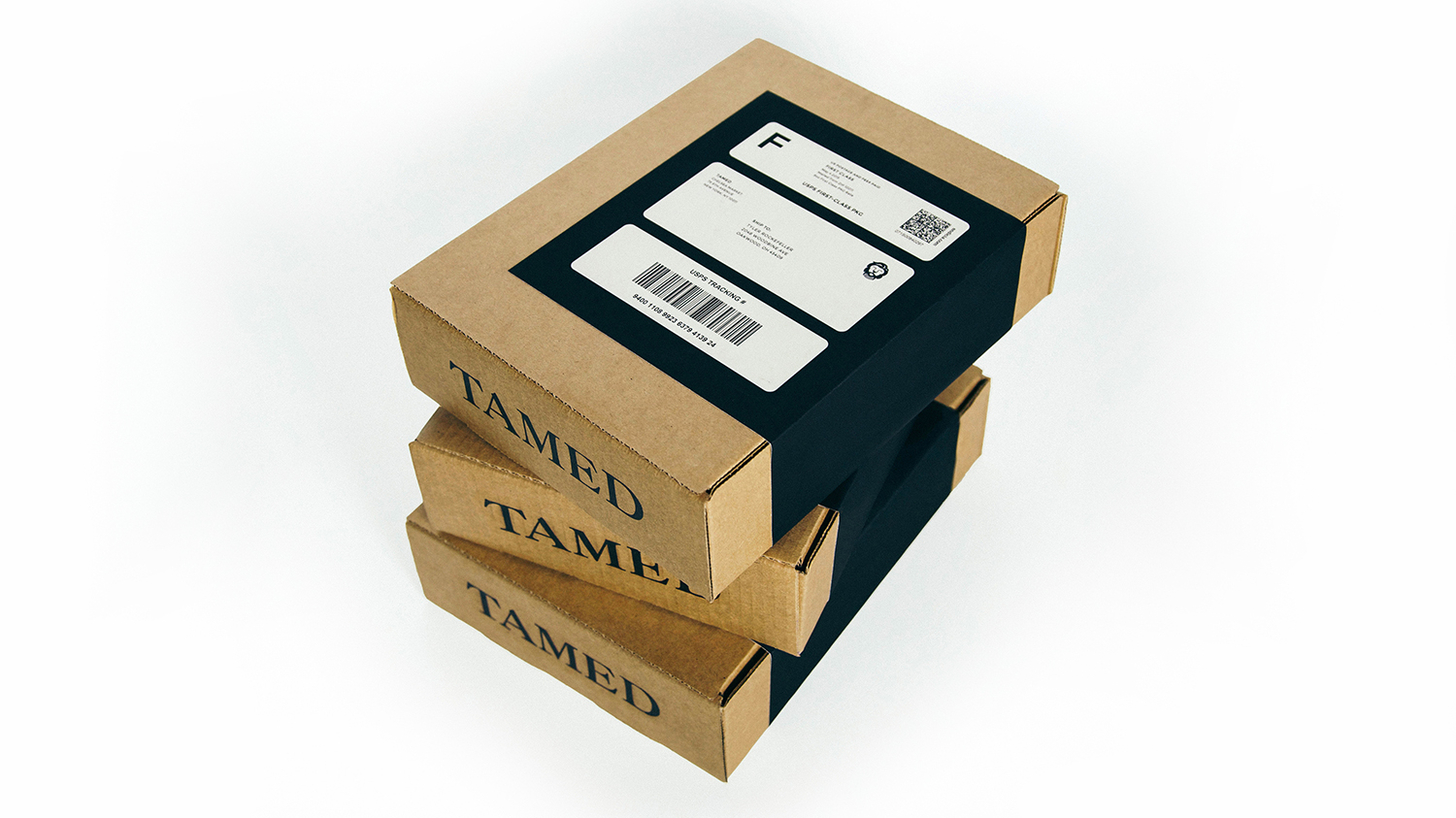
Tamed is a fictional business I created to experience branding a company entirely from scratch. I started with the broad idea of constructing a male grooming salon and subsequently formed the name, story, and brand guidelines. I designed business cards, a services menu, website, social media campaign, and shipping package for online purchases. Additionally, I designed an invitation package to kick off the collaborative loyalty card program between Tamed and Flora Nest (another fictional business that I constructed the general idea, story and logo for), to be mailed to the dearest customers of both businesses.
Our Story
Tamed is a family owned male grooming business that was originally established in 1925 as a barbershop based in New York. We closed our shop in 1972 in order to focus solely on our handmade, caffeinated shaving creams, which have become widely known for their energy kick and their ability to steer clear of razor-bumps.
In celebration of 90 wonderful years, we are re-opening our shop and providing a whole new experience for our loyal patrons.
We are pairing up with local businesses in our community and encouraging our customers to relax while enjoying complimentary samples from shops located within walking distance. Our goal is to provide a full service grooming bar experience while revolutionizing masculinity in a salon environment. In this liberated atmosphere, we are reshaping the male grooming experience.
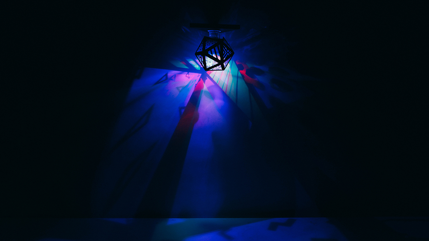
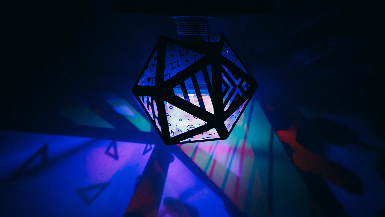
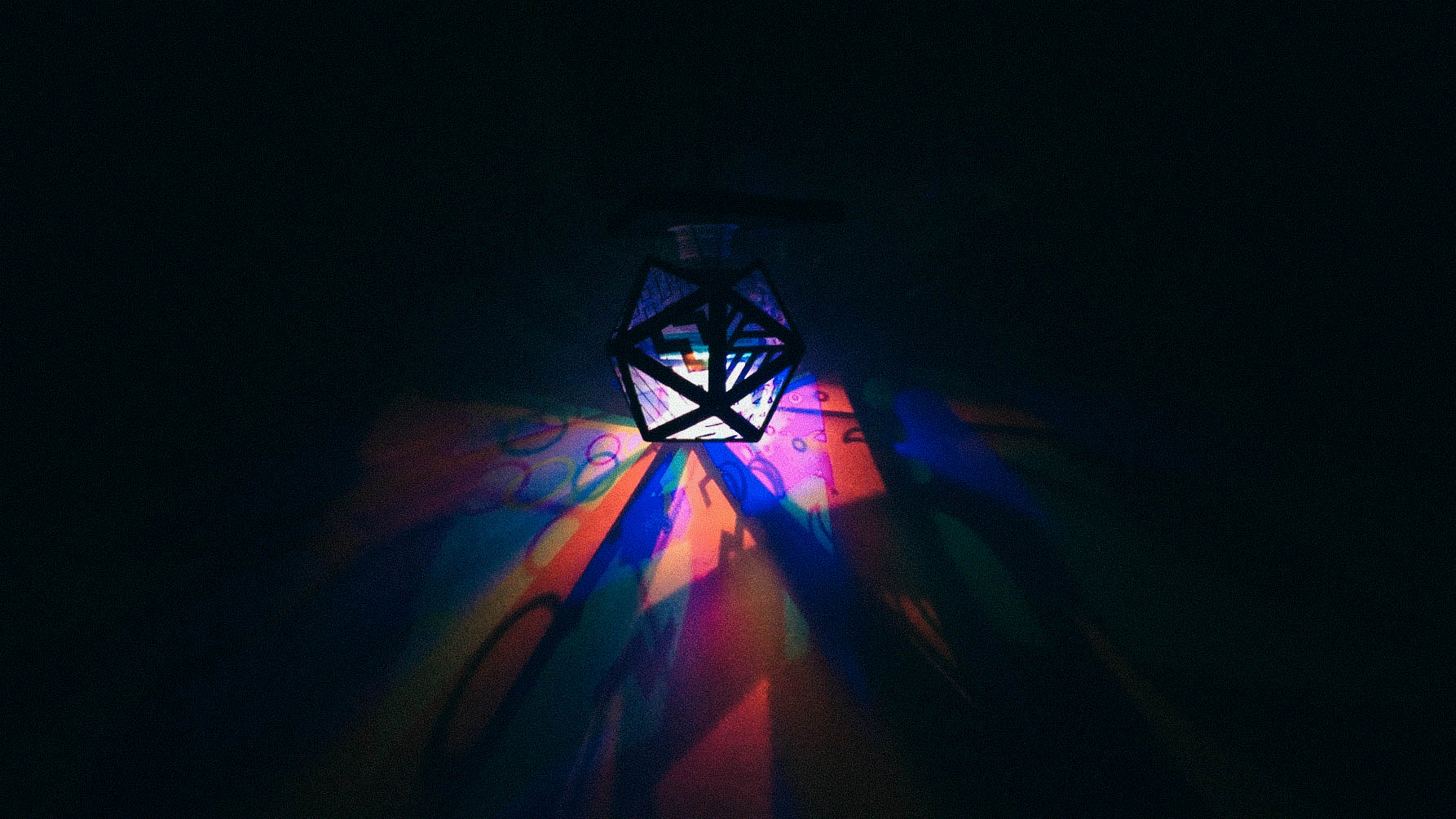
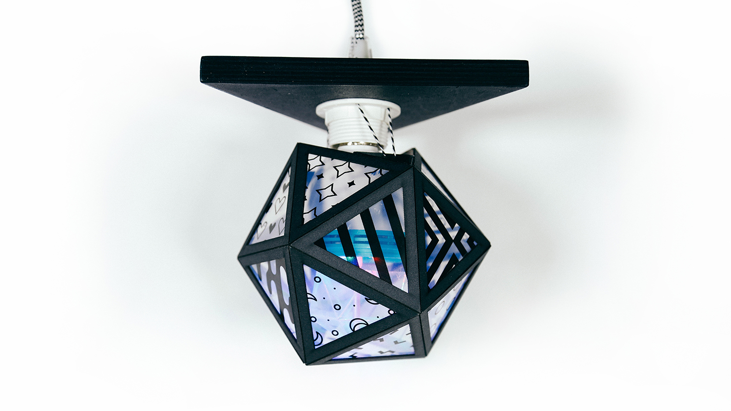
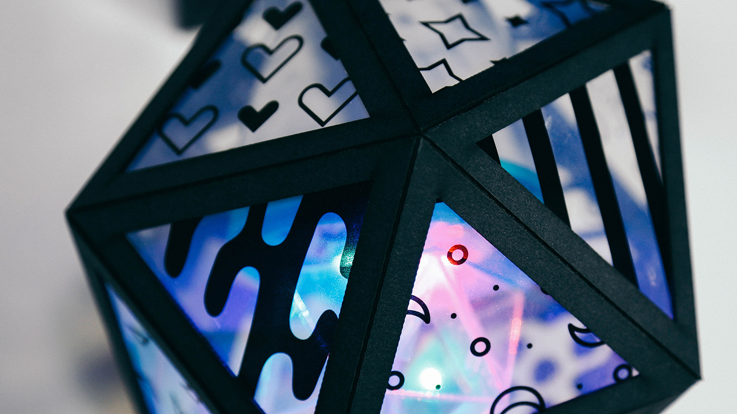
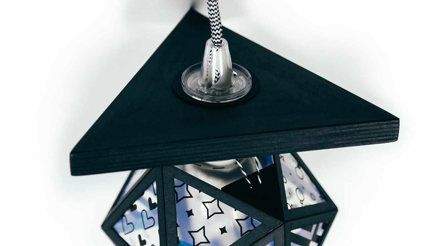
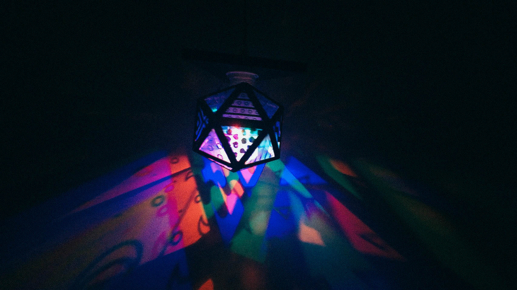
Faridah Adam and I designed and constructed a kaleidoscope pattern lamp, experimenting with the Laser Cutter, CNC Router, and 3D Printer. There was one catch to this project: everything cut or printed was to be made up of the same basic shape—a triangle. After collaborative brainstorming and a long list of crazy ideas, I found a rotating light bulb online to take apart and customize. We laser cut the inner, rotating plexiglass globe and the larger outer globe, CNC cut the large base for the bulb, and 3D printed the pieces to hold everything together. After using each of the machines to our advantage to create the lamp structure, we designed 18 patterns to add to the inside of the outer globe for the light to shine through and create the kaleidoscope effect we were going for.
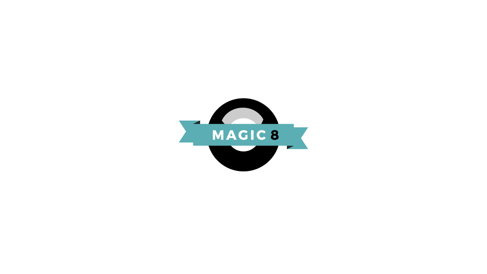
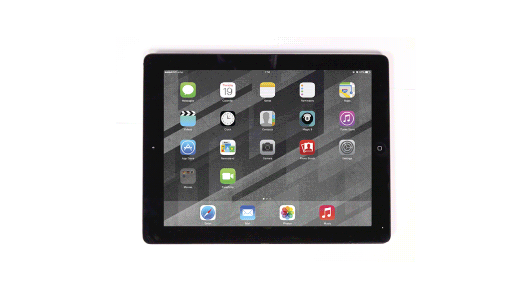
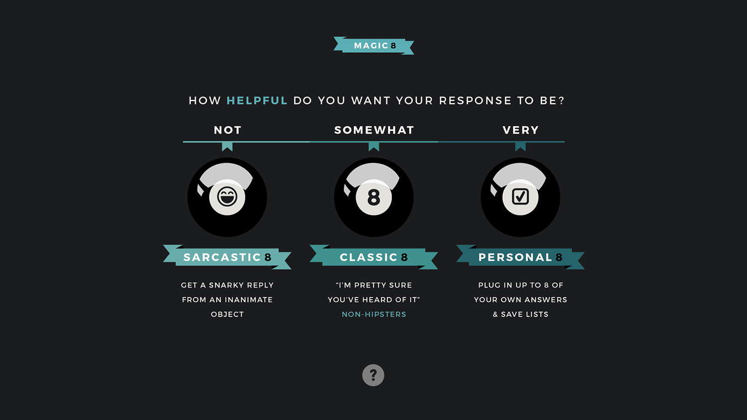
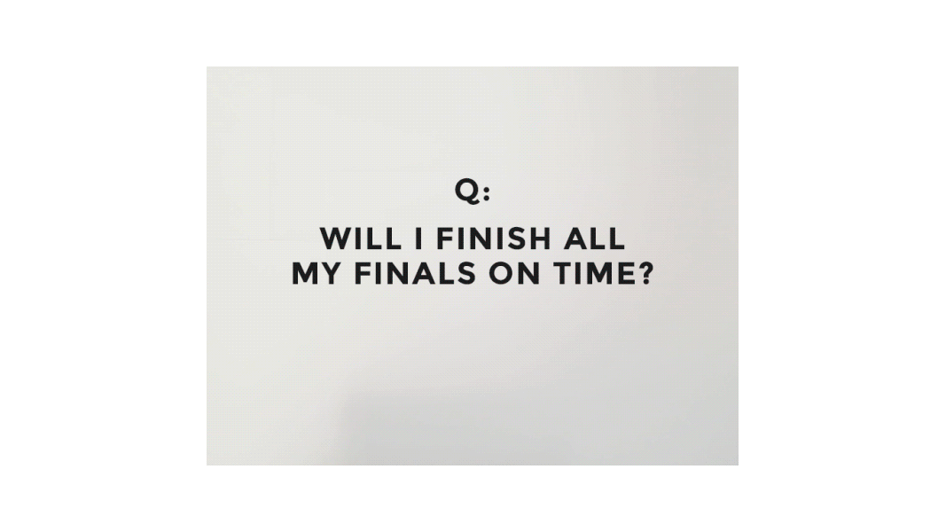
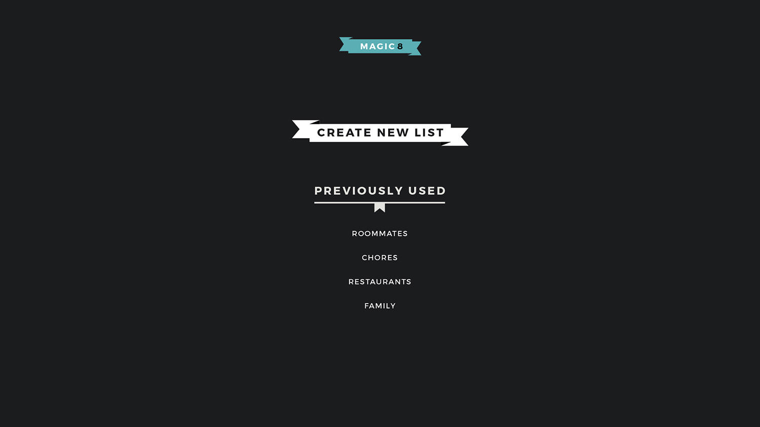
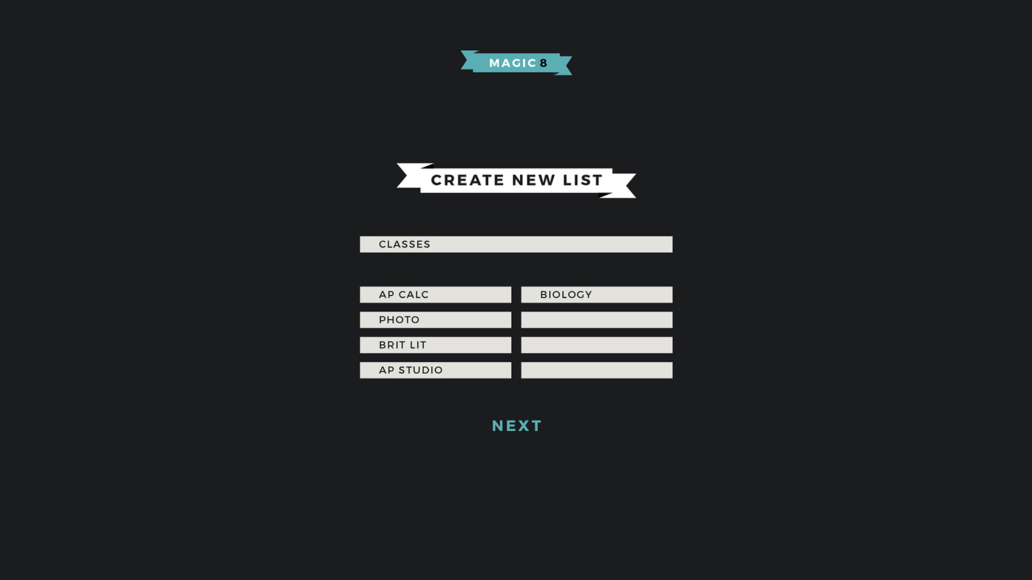
I’ve developed the concept and design for an App that makes decisions for the user based on 3 subcategories. Classic 8 Ball is one we already know too well, with answers including “Yes”, “My Sources Say No”, and “Ask Again Later”. Sarcastic 8 Ball leans toward the goofier side of the app, giving you a snarky, not-so-helpful answer when you ask a question and shake the device (like a physical Magic 8 Ball). Personal 8 Ball allows for the user to plug in their own answers, serving as an effective tool to help the indecisive choose between their options for any pondering questions, incomplete tasks, etc.
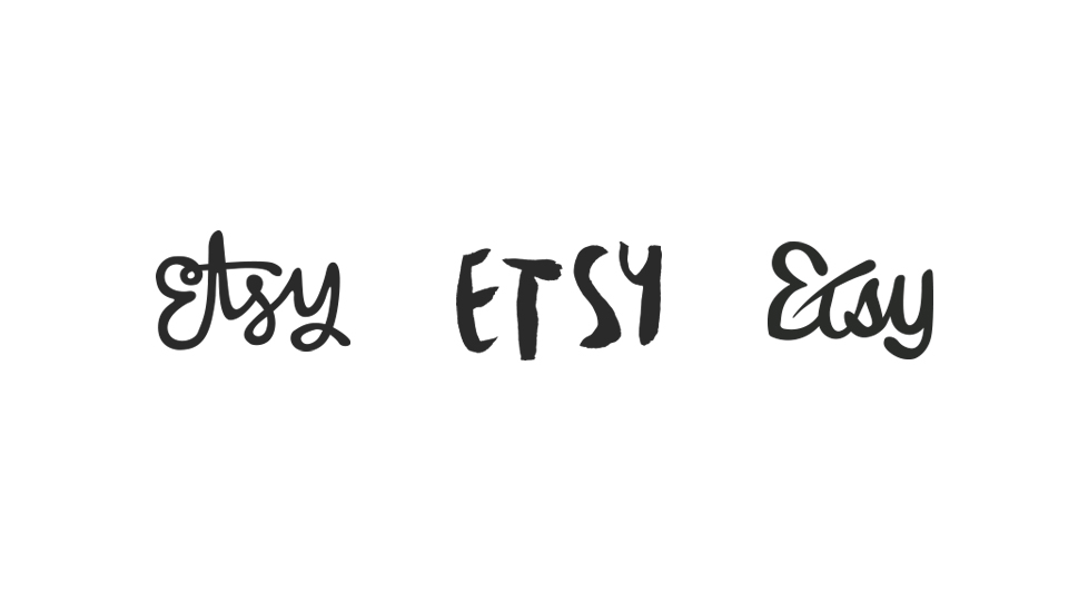
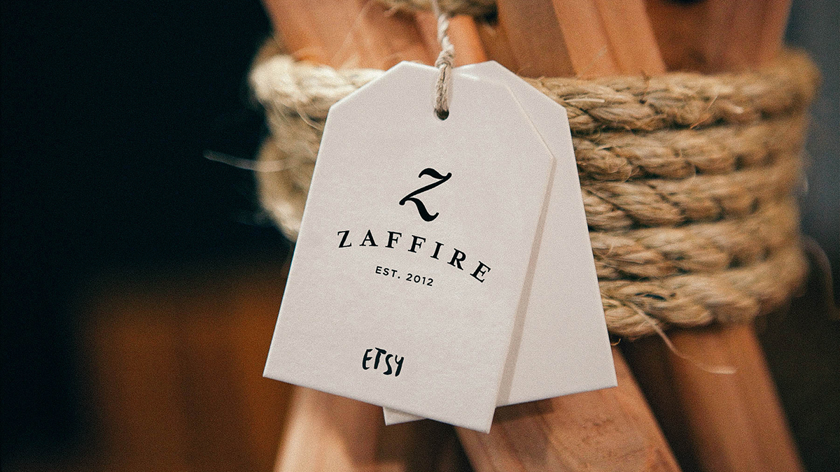
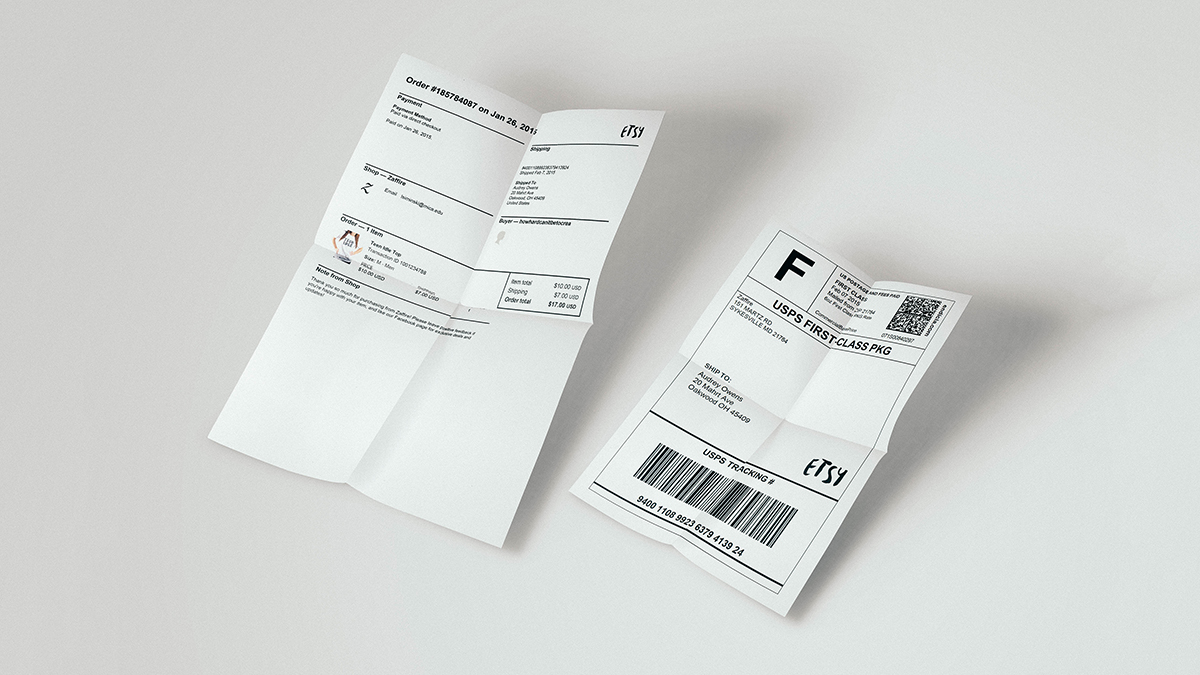
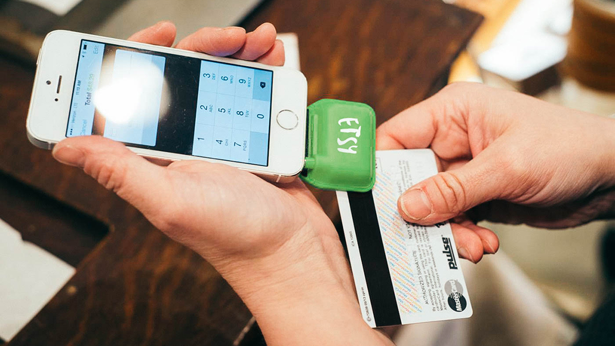
I wanted to design a more appropriate logo for Etsy that showcased their business fundamentals. I developed a main problem statement and translated that into the central question: What aspects of Etsy can I represent visually in the logo mark to allow any viewer to see it and gain an understanding of the whole company? I focused on 3 keywords—Community, Handmade, and Sustainability—and created several logos that fit into one or more of these categories. The final logo combines these keywords with a friendly, approachable, handmade overall feel.
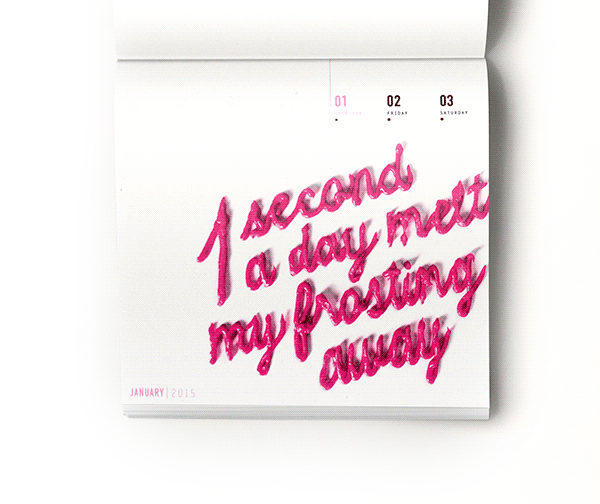
A passion for hand-lettering and a developing interest in experimenting with unconventional mediums lead me to design this 53-page, photography-based weekly 2015 calendar. After a couple attempts of lettering with frosting, I discovered it was a piece of cake (pun intended). With a hairdryer, I melted “1 second a day melts my frosting away” and photographed the reaction every 7 seconds, giving the phrase a literal meaning. The rest of the calendar features dates that move/expand throughout to mimic the frosting and burned holes under every date to add an additional elegance.


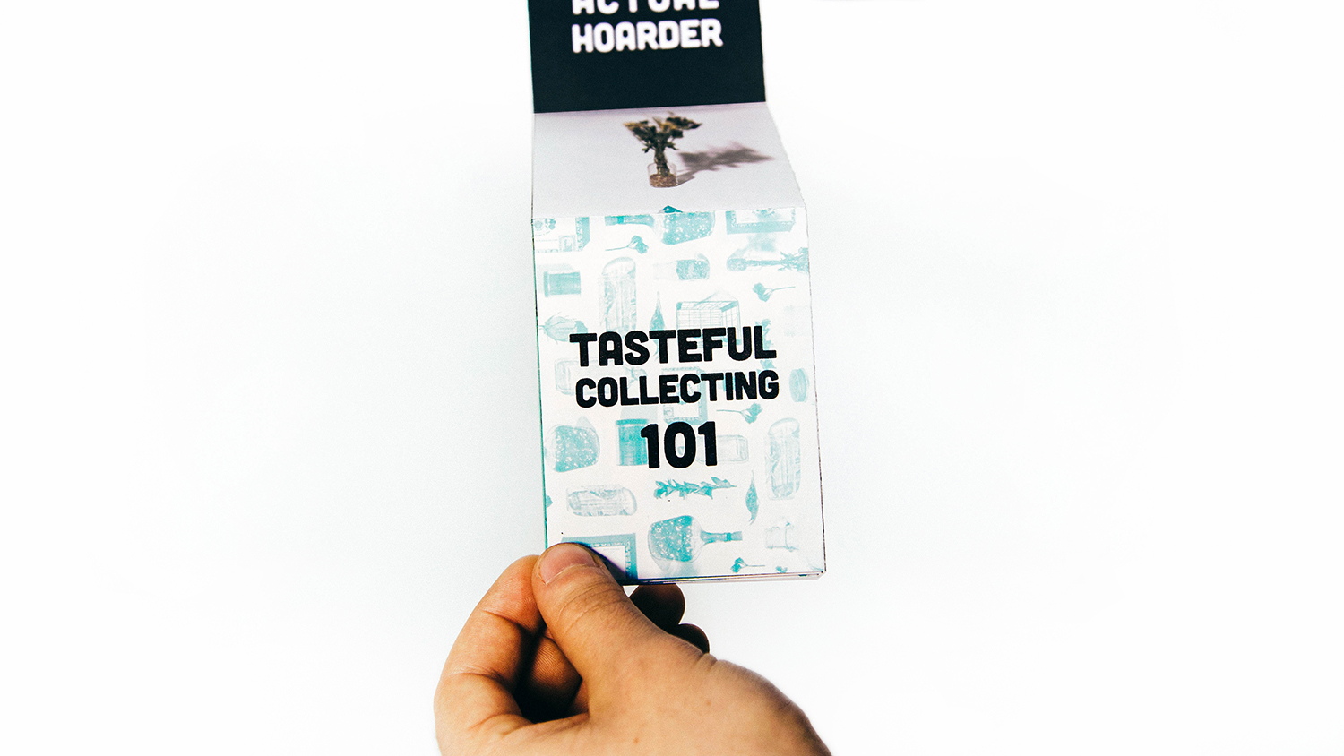
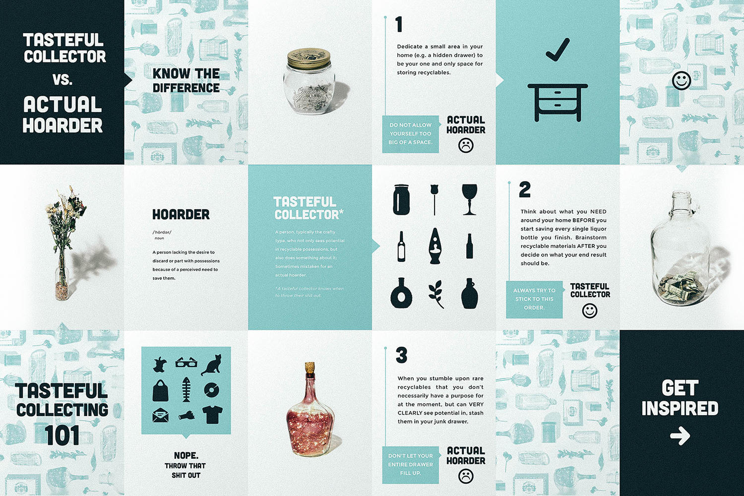
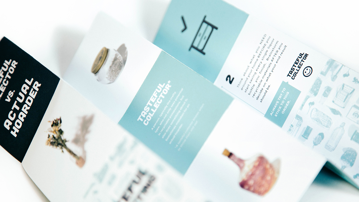
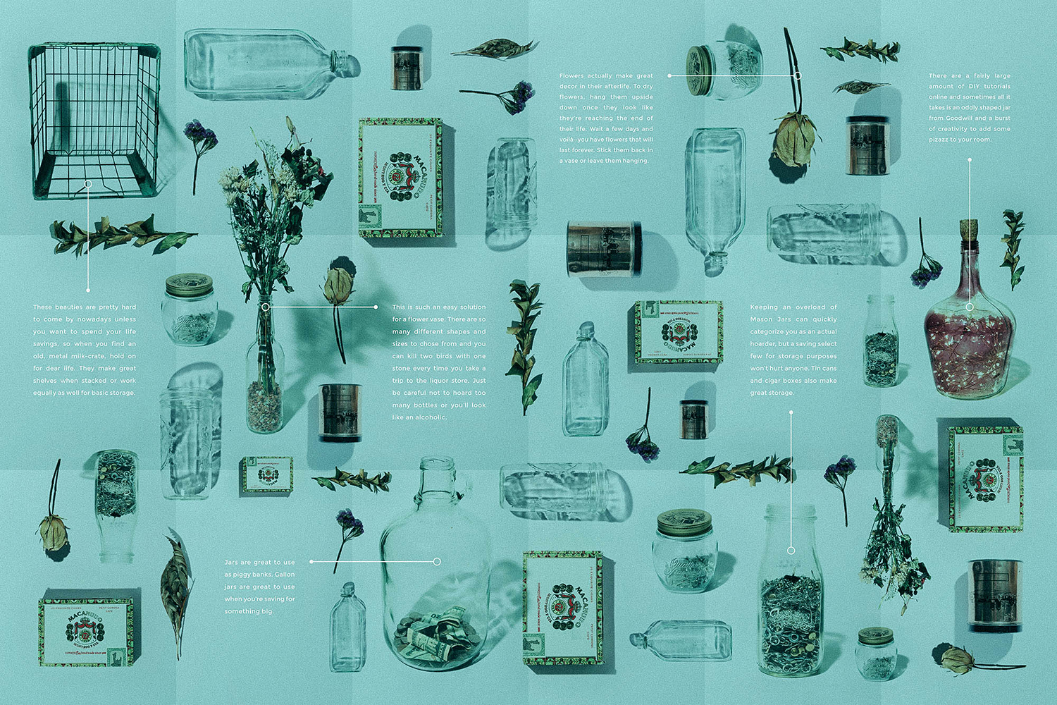
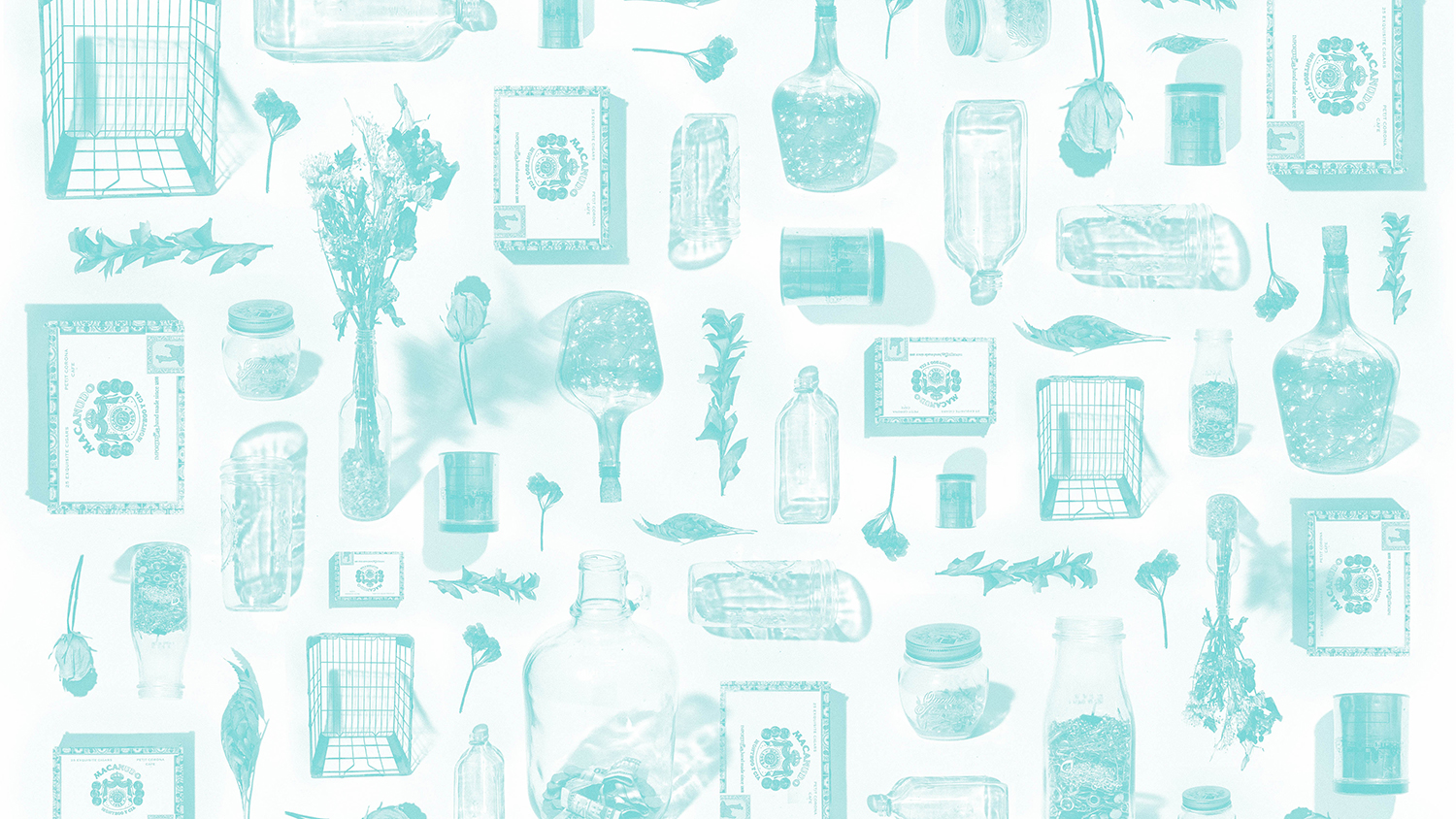
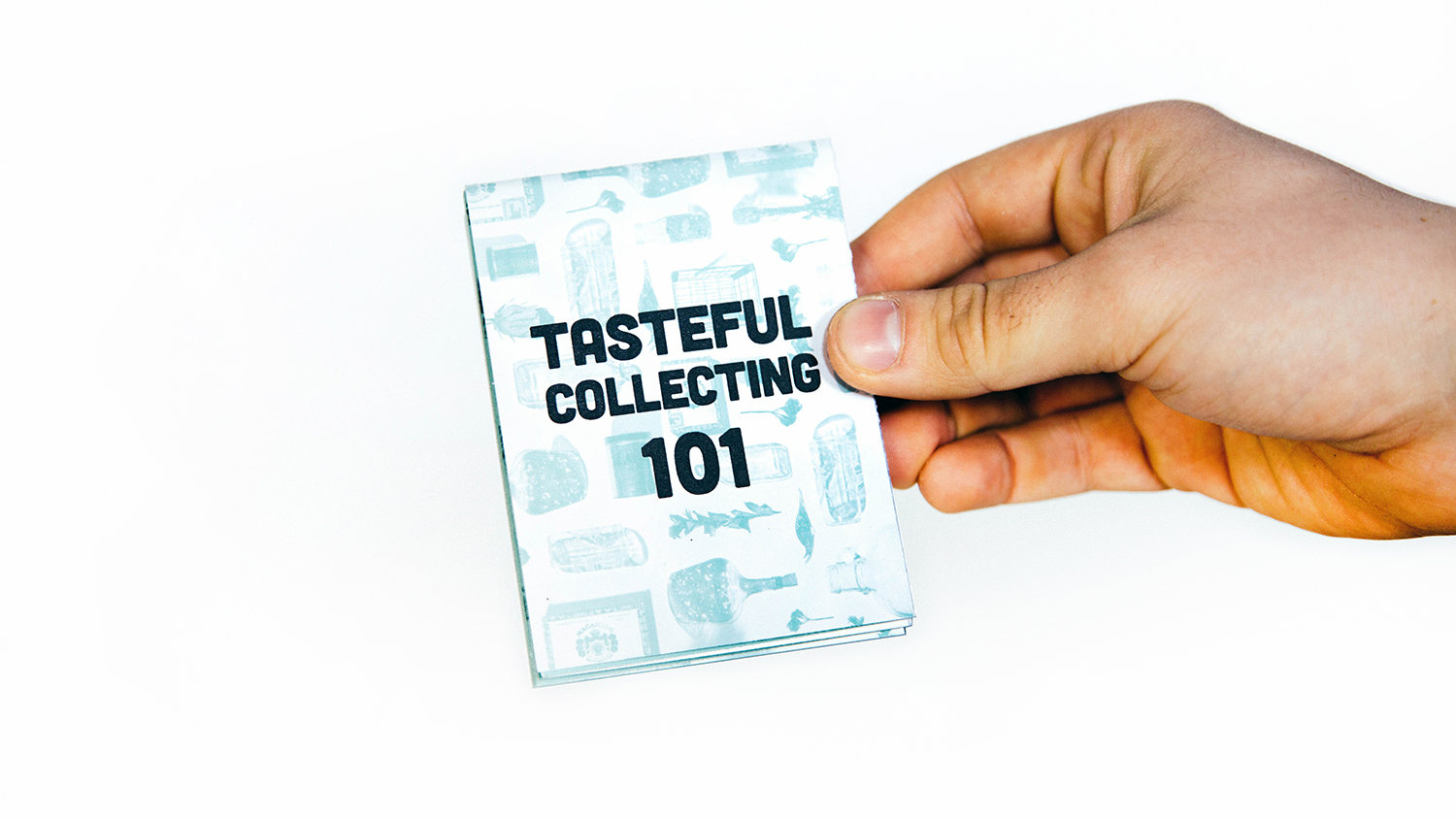
“Tasteful Collecting” is my subtle way of confessing that I’m—let’s just face it—a hoarder. But unlike the compulsive disorder we see on television with (in the most serious of cases) dead cats buried under years and years of trash, I use my hoarding habits to my creative advantage. This foldable guide breaks down the difference between actual hoarding and smart hoarding, essentially taking your recyclables and using them for storage, decoration, or DIY. For my guide, I created an original pattern and a map with effective examples from photographs of actual items you can find in my room.